Smash Song Hits by Rodgers
& Hart performed by the Imperial Orchestra conducted by Richard Rodgers
Alex
Steinweiss logo on the Columbia covers.
In the beginning
for many LP records a convenient basic design was used which only needed filling
in names of artist(s), composer(s), compositions and reference number on the tombstone
of Columbia's covers.
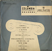
The Steinweiss cover for
the 10 inch Columbia release in 1950 of music by Sibelius and Rachmaninoff performed
by Eugene Ormandy and The Philadelphia Orchestra ML 2158.
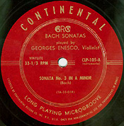
Remington's first label
in the style of the Continental label.
Remington's original second
label.
Alex Steinweiss
'signature' written in the so called Steinweiss scrawl as it appeared on
Remington releases.
Remington's
catalog, published in the fall of 1952, showing the new design. The cover is by
Alex Steinweiss of course.
The first
label Alex Steinweiss designed for Remington Records. Inc. It is Remington's third
label and has Don Gabor's signature. It also shows the crown which was retained
from the early label. But the style bears Alex Steinweiss's signature.
The fourth label designed
for the MUSIRAMA recordings.
In
1939, 22 year old Alexander Steinweiss proposed to Columbia to make a change in
the presentation and packaging of the 78 RPM record albums. Sleeves for single
disks were often made of plain paper or had more elaborate designs which served
as advertisements not directly linked to the recorded music pressed on the disk.
Big record companies everywhere put their disks in sleeves with elaborate designs.
Here four examples of European 78 RPM record sleeves from the 1930s: Columbia
(Great Britain), Polydor (Deutsche Grammophon), His Master's Voice (advertising
the HMV reentrant horn) and Telefunken (with the image of violinist Georg Kulenkampff).
Multi-record
releases in albums were rather simple if compared to the stylish 78 RPM sleeves.
Below is the Columbia album CX 120, later renamed MX-120, of Liszt's Todtentanz,
performed by pianist Edward Kilenyi and conductor Selmar Meyrowitz, on 2 x 12"
78 RPM disks.
So,
why not adorn these albums with graphics too? Steinweiss's idea was to use original
artwork (drawings and paintings) on the front of the albums specifically
related to the recorded work(s). This approach was quite a change, even if
compared to the more luxurious gold or silver imprint of the nomenclature in a
serif or gothic font on the black, green, brown or beige heavy books.
The
design of the albums was derived from the photo album design with a plain and
simple layout and lettering as this European release of HMV (Victor in the USA)
shows. Isolde Menges performs Beethoven's Kreutzer Sonata, accompanied by pianist
Arthur de Greef. His Master's Voice D 1066/69 electrical recording, date November
10, 1925.
This
album is testimony of the revolution in album design. It shows Alex Steinweiss's
style to the full. Pianist Oscar Levant plays George Gershwin's Rhapsody in Blue with the Philadelphia
Orchestra under Eugene Ormandy on Columbia MX251 (on LP ML4026). NOTE: This
is not the world's first album cover ever, because that was for a 1939 collection
of songs by Rodgers and Hart. It is also not the factual best selling cover of
the Rhapsody played by Alec Templeton with André
Kostelanetz which I only have in its plain edition and was released only much
later on LP in January 1952, ML4455. The Templeton album which was illustrated
by Steinweiss shows a small, white piano under a street lamp which is in fact
a trumpet, the suggestion of the New York skyline in black, plus the lettering
which is, as always with Steinweiss, an integral part of the design.
Even
though Steinweiss's idea seems a logical step, the idea itself was revolutionnary
and had a vast impact on the record business. The new look skyrocketed the sales
of a Rodgers & Hart album (with orchestra conducted by Richard Rogers) which
was already on the shelves but now it was apealing even more. From
that day on, of every new release sales were boosted above average and the artistic
packaging became an important part of the record. Soon this idea was adopted by
every record company.
Imagine,
being that young and your idea is accepted by an important company. The idea is
provocative, it is revolutionary, and it links a commercial concept to a high
artistic quality. That is thrilling. At first sight there is a slight reminiscence
of cubism and art deco, but it follows its own development. It breaks with old
fashioned thinking. Now the liner notes of the albums are also styled in a modern
way as is shown by the later release of a box with two 12 inch shellac records
with the recording of Suite No. 1 from Peer Gynt (Grieg), Eugene Ormandy conducting
the Philadelphia Orchestra (Columbia Masterworks Set MX-291).
In 1948, almost 10 years after Alex Steinweiss proposed the illustrated album
cover, Columbia presented the LP format to the public. The advantage over the
78 RPM album was first of all the increased capacity. A symphony on 4 x 78 RPM
records could now be engraved on a single long playing disc. The new medium did
not need the fat, heavy albums any longer but could do with a simpler sleeve.
Many standard sleeves for 78 RPM records in albums were made of Kraft paper, folded
together and glued either at the spine and top, or at the top or bottom and as
some state with a strip folded inside the sleeve. If this method was applied to
sleeves for the new LP record, it could damage the vinyl. (In my collection of
78s all albums and sleeves, post- and prewar, have so called flip back seems,
this means that the seams or strips were glued on the outside instead of the inside!)
Now
a new sleeve had to be designed for the LP. Columbia asked Steinweiss to design
a cover specifically for a single Long Playing Record. That is what he did. He
also designed the box set, both for 33 RPM records and for shellac as is shown
in the picture of Set MX 291.
Alex
Steinweiss with a few of his designs for Columbia records, photographed by William
P. Gottlieb in 1947. Courtesy of William P. Gottlieb. (Copyright W.P.Gottlieb.)
Alex
Steinweiss (March 24, 1917, Brooklyn, New York) graduated from Abraham Lincoln
High School and was trained by Leon Friend, the school's first art department
chairman. Young Alex received a scholarship from Parsons School of Design (New
York). He graduated in 1937, and was for two years assistant to Joseph Binder.
In 1939 he was retained as Art Director at Columbia Records, and was appointed
Advertising Manager for Columbia Records in 1943. From 1943 until the end of the
war he was Exhibits Engineer in the US Navy TADC (Tactical Air Direction Center).
In 1945 he settled as a free lance designer and consultant, painter and ceramist,
working for a variety of companies and industries, including Columbia Records,
and was a free lancer ever since. In 1981 he was appointed to the Board of Trustees
of the Ringling School of Art, Sarasota, Florida. He was appointed honorary member
of the Board of Directors of Asclo Opera, also in Sarasota. Numerous are the entries
in reference books, and articles in magazines beginning in 1940 in Printer's Ink
(1940), Art and Industry (1942), Who's Who in America (supplement, October 1943),
Down Beat (1947), Graphis Annual, Professional Cartooning, Modern Publicity, etc.
He exhibited in galleries and museums in the US and Europe (Great Britain, France,
Germany, and other countries). Right from 1939 on he received many awards, a total
of at least twenty, the last was in 1993 in Sarasota where he was honored by Temple
Emanu-el along with 9 other Sarasota visual artists. - Biographical synopsis
Alex Steinweiss sent to me in the summer of 2002. - R.A.B.
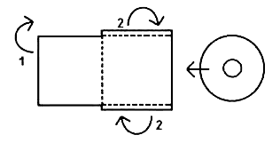
The
first design was a sleeve made of rather thin Kraft paper with the opening at
the top (1948).
Later
Steinweiss came up with the folded cardboard which became the standard of the
industry in the USA. His basic design was soon varied upon (in all sorts of forms
with the fold at the spine, the two separate sheets with a reinforcement at the
spine and/or a reinforcement at the top and bottom seem), but it remained in essence
the same, up to this day.
Generally a larger sheet with the printed art was folded and glued over the edges.
The square sheet with the liner notes was glued on the back, as the drawing shows.
The reverse way was also done: the sheet with the liner notes, larger than the
actual cardboard, was folded over the edges and the square sheet with the artwork
was glued on the front. In some designs the top and bottom seams were reinforced
with a small strip of some strong fabric which was glued into the seam.
In
Europe various solutions were devised. Early Dutch Philips covers were of the
gatefold kind, as were several VOX productions from Great Britain. Deutsche Grammophon
had the gatefold with the record compartment fixed at the edges with blue linen
tape. The records were slipped into a compartment made of somewhat less rough
paper. Electrola had a gatefold similar to the Deutsche Grammophon. Later Deutsche
Grammophon as well as the Electrola covers were later lined with a plastic sheet
(polyurethane?). However the Electrola covers were not stitched but glued at the
edges bonded with a light colored linen tape.
The
Deutsche Grammophon gatefold and plastic lining stitched in the gatefolds had
an appeal of quality but often this "quality" was the cause of a damaged,
scuffed or scratched record as the LP had to be grabbed at the periphery and pulled
out of the flat opening of the compartment. Often the sheets were not opened correctly
and the record was slipped in wrongly. The best way to go about is to place the
right part of the cover on a flat surface, open the gatefold, then separate the
plastic lining and gently take out the record.
Form
follows function. In hindsight this adage did not entirely apply to the Deutsche
Grammophon covers. The designers may have thought differently at the time, the
same as so many designs of today forget about the functionality. Go to the super
market and get irritated by products with a confusing, weird packaging, so the
client gets lost. Or browse the world wide web and stumble upon several didactically
ill designed pages which take up too much time for the visitor who has to find
out and understand the way of thought of the person who built the page and who
makes navigation more difficult than is in fact necessary. Not with Alex Steinweiss.
His design solutions are practical. His artwork is communicative, almost interactive
in the modern sense, because of balanced composition and fine detail.
The
7", 10" and 12" of the popular Polydor records had simple covers,
also stitched at the sides, the opening at the top. This was in fact a follow
up of the heavy felt like covers of the 78 RPM quality labels from before World
War Two which were stitched also at the sides.
Later
EMI, Decca and Philips in England and Dutch Philips were put in so called flipback
covers. In Germany Telefunken and RCA had also a folded cover. The fold was at
the bottom and the sides were glued together. The opening was at the top.
As
said, in the USA however many Columbia LP records (and in the beginning those
of most manufacturers) were put into flimsy, all purpose sleeves with a basic
graphic design. It sufficed to print the names of the artists, the title and the
reference number on the front and some liner notes or a list of other available
records on the back. Many early Remington releases in 1950 and 1951 were
also slipped into thin, floppy all purpose, generic sleeves with only different
titles printed on the front. Some of the early recordings had already their own
art created specifically in relation to the music.
The
earliest Remington release of Tchaikovsky's Symphony No. 6 conducted by H. Arthur
Brown (RLP-199-13) in a floppy paper sleeve, yet already with specific artwork.
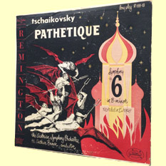
The
second cover of Tchaikovsky's Pathétique conducted by H. Arthur Brown is
in the new Steinweiss style by Einhorn.
A
pre-Steinweiss cardboard cover of the recording of Hans Wolf conducting Symphony
No. 2 by Johannes Brahms on RLP-199-19. Cover by Sherman Alpert.
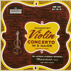
Sherman
Alpert also did the cover for the first edition of Tchaikovsky's Violin Concerto
on RLP-199-20 performed by Michele Auclair.
The
pre-Steinweiss cover of RLP-199-50 with Debussy Preludes played by Edward
Kilenyi. The initials of the designer are EDL, the year is 1951.
The later
cover for Debussy's Preludes Book 1 designed by Curt John Witt in the new Steinweiss
setup.
Many
of the designs for the early Remington red-label productions were made by a man
named Freeman (the reviewer?).Other names that came up were of
Sherman Alpert, Raboni, and for Plymouth it was Roy E. La Gione.
When profits had been made, the product's appeal could be improved upon to further
boost the turnover. Now new sleeves were designed by someone whose initials were
E.D.L., by Einhorn and already by Curt John Witt who also
made many covers for the Plymouth releases which often contained the recorded
material originally issued on Remington. Instead of pictures of the artists and
listings of other recordings available, now the covers had liner notes. As no
initials or a name of the author was mentioned, it is unclear who wrote the liner
notes. It is possible that also some were written by George Curtiss, Don Gabor's cousin and
managing director of the Webster pressing plant in Massachusetts.
As
the competition was growing, producer Don Gabor was convinced that he needed the
full attention of the buyer and that he should have covers that
The
first label Alex Steinweiss designed for Remington.
were
well designed and that the style should have distinctive features in order to
be recognized so the discs would be able to compete with the products of the big
companies. So why not ask the man who designed the covers for Columbia Masterworks,
Alex Steinweiss, to develop a corporate image and a basic design for the covers
and the label of Remington records.
Alex Steinweiss designed a new basic layout for the label, the covers of Remington
LPs, and for the company's business presentation. In fact Steinweiss designed
a complete corporate image for Don Gabor's company. He designed the third Remington
label, the black-gold label with the letters REMINGTON placed in boxes arranged
in a circle at the periphery of the label, including a box with a crown. Above
the nomenclature (in the upper half of the label) the text "A Don Gabor
Production" was placed in Steinweiss hand-drawn lettering (typeface),
later copyrighted as "Steinweiss Scrawl".
The
same elements adorned the covers. On the left the letters REMINGTON were placed
in boxes in a vertical row, topped by a box with the same "A Don Gabor Production"
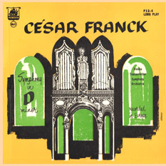
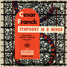
and at the bottom a box with the crown. The idea of the design for the covers
could have been triggered when the early cover for César Franck's Symphony
in D was discussed during a brainstorm.
For the new cover the logo with laurels was later replaced by a new oval emblem
with the text Complete Audible Range Reproduction, a logo that was to suggest
the same technical quality as Full Frequency Range Recording (English Decca
and London Records), New Orthophonic High Fidelity(RCA), Living Presence(Mercury),
Full Dimensional Sound (Capitol), etc. CARR was later replaced by the MUSIRAMA
triangle.
Designed
by Alex Steinweiss: 'A Don Gabor Production', the crown, the vertical row of boxes
which spelled REMINGTON, plus the heading on the stationery (and other documents)
with the slogan 'music for millions', the capital R on the catalog with the Remington
logo, and the black/gold sticker with the important text 'factory sealed', they
were, from July 1952 on, the elements defining the corporate image of Remington
Records Inc. The Musirama recordings were announced in the 1953 catalog and the
new label was introduced in the following year.
When
better recordings were made under the supervision of both Laszlo Halasz
and Don Gabor, improved microphone placement was devised by Gabor's technician
Robert Blake. Blake later recorded for the Everest label as a few Everest covers
indicate. The specific microphone technique was named MUSIRAMA, indicated by a
triangular logo put on the cover. "MUSIRAMA" was also added to the label.
The earlier "A Don Gabor Production" logo with laurels was replaced
by the atomic symbol and the wording "3 dimensional sound".
The graphics of the labels are extremely beautiful because of the combination
of a serif typeface for the label name - REMINGTON - and a sans serif, gothic
type for reference numbers and the description of the contents of the recording.
Steinweiss also designed a basic layout for the back of the cover to complement
the new style of the MUSIRAMA editions: frames, typefaces for titles, liner notes
and reference numbers, positioning of logo, etc.
Alex
Steinweiss is noted for his Columbia covers and one easily gets the impression
that this was the only label he worked for. But it is significant that he designed
the covers for other labels as well. And he worked with other designers and artists
like Curt John Witt (later covers indicate "Curt John Witt Design
House"; he also designed for Allegro Royale and Opera Society), Leonard
Slonevski, Wattley and Otto Rado. And Albitz and H. Kaebitz.
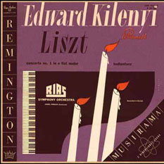
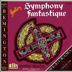
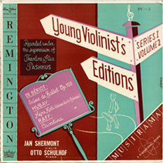
From Kaebitz's hand is the cover of Symphony Fantastique. It displays a sinister
purple color, and a cross adorned with faces. He also designed the covers for
the Young Violinist's Edition of Alice
and Theodore Pashkus.Albitz is the artist of Kilenyi's Liszt album
where on a purple background the shapes of a grand piano and candles with flickering
flames indicate the romanticism which was seen a couple of years earlier in the
1945 biopic of Liszt's contemporary Chopin, "A song to Remember", where
Merle Oberon (as George Sand) walked into the non-lit room and places the candelabras
on the grand piano, thus revealing that Frederick Chopin (Cornel Wilde) was playing
instead of Franz Liszt, what everybody expected. (The piano part was played by
José Irturbi).
GABOR
IN BERLIN The Albitz Covers - 1954
Don
Gabor and Laszlo Halasz supervised the MUSIRAMA recordings made with the RIAS
Symphony in Berlin. It is not sure if Gabor was present during all recordings,
but it is known from the Varèse-Sarabande 'The Remington Series', that Gabor was
present in Berlin on several occasions, while Halasz was always present when recordings
of the orchestra were made. At times also Remington recording engineer Robert
Blake traveled to Berlin.
Both
Gabor and Halasz were of European origin and they certainly took part in the Berlin
cultural life after production hours. In Berlin there was still a lot of suffering
going on, because of the vast destruction of the city during the years of war.
But there was also a new élan to rebuild Berlin and its
culture, and a new Germany. The will to move forward and make things better was
also illustrated in 1953 with the uprising in the Russian sector. That was the
Berlin in which Gabor and Halasz arrived and where they were going to make recordings
in 1954, in West Berlin.
Gabor
and Halasz were moving in artistic circles meeting other producers (for example
those of the Bertelsmann firm); radio people (when they were negotiating the recording
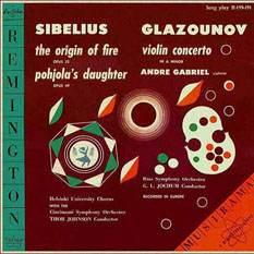
of the Glazunov Violin Concerto performed by Roman Totenberg); musicians like
cellist Eberhard Finke, leader of the 12 Cellist of the Berlin Philharmonic, violinist
Saschko Gawriloff and members of the Koeckert Quartet. In this way they got acquainted
with the artistic and intellectual life in Berlin of 1954. It is very plausible
that they also met with Ruth Geiss who was married to Hans Albitz.
Hans and Ruth Albitz were a young designer couple. They were in their early thirties
at the time and had already made a name for themselves in Germany.
It
is known that Gabor - together with Steinweiss - supervised the creation of record
covers. Records were pressed in the Remington pressing plant in Massachusetts.
The covers were printed there as well. Spending time in Berlin making recordings
would postpone several releases of new material. And that is probably why Gabor
asked the Albitz couple, or specifically Ruth Albitz, to do a few covers
for recordings that were in the making or had already been taped with the RIAS
Symphony. Another reason could be that Gabor always had an eye for the unusual
to have the Remington label stand out. Covers designed in Europe could add to
the quality and the origin of the recordings. And on top of that, Gabor loved
art.
The
covers for the respective recordings of the RIAS Symphony Orchestra with conductor
Manuel Rosenthal, pianist Edward Kilenyi and conductor Jonel Perlea, and the recording
made with Gerhard Becker, all bear the name Albitz. Although there are people
in America with the name Albitz, these covers must have been designed by the Albitz
couple, and specifically the Gerhard Becker recording by Ruth Albitz. The style
of that cover reminds one of the cover for the book 'Sei Schön und Charmant'
(Be Beautiful and Charming) by author Alma Archer, with drawings by Ruth Albitz-Geiss.
The influence of her husband is seen in the more formal designs of LP covers.
Note
that the cover for the recording of French Overtures conducted by Gerhard Becker
does not indicate the designer, and that the cover for the orchestral Medley from
The Beggar Student, also conducted by Gerhard Becker, was designed by Otto Rado.
Gabor
could have followed the same procedure in case of the covers for the recordings
of George Sebastian (Symphonie fantastique, Wagner Overtures, Wagner Favorites).
Could well be that H. Kaebitz is also a German graphic designer who was recruted
during one of Gabor's stays. H. Kaebitz is also responsible for the cover
for the recording of La Boîte à joujoux (Debussy) conducted by Jonel
Perlea. Kaebitz made the covers for the Young Violinist's Series (Shermont and
Schulhof) as well. So the stay in Berlin was fruitful in more than one aspect.
- Rudolf A. Bruil - February, 2014
Rudolph
de Harak (1924–2002)
designed three covers for Don Gabor, two for a Remington releases and another
for a Pontiac release, around 1952. He later became famous for designs for the
Metropolitan Museum, the United States Pavilion at the Osaka World Fair, for 'Man
Planet Space' in Montreal, 1967. He also designed the 'Quadra' typeface and more
than 400 book jackets for McGraw-Hill's book division. Also an artist named
Riser provided record jacket art.
Burt
Goldblatt (1924–2006) designed the cover for the recording of Liszt and
Brahms by Karl Rucht conducting the RIAS Symphony Orchestra (R-199-218).
Steinweiss
himself designed covers, and he coordinated the work of the other artists as well.
In the beginning existing covers were adapted to the new lay out. But as soon
as new recordings were to be released, new artwork was made and even particular
covers that were already restyled, were replaced by covers with new art work.
The most significant example is Edward Kilenyi's recording of the Chopin Waltzes
which could be obtained in (at least) two different editions.
Another
noted cover by Alex Steinweiss for Remington R-199-126 with the Steinweiss Scrawl
in abundance: Violinist Michèle Auclair plays Kreisler Encores accompanied
by pianist Otto Schulhof.
The
designs made by Steinweiss for Remington are not always as elaborate as most of
the covers he did for Columbia Records. But there are exceptions of course. An
example is the beautiful cover for R-199-128 with violinist Michèle
Auclair and cellist Gaspar Cassado playing gems. However, the similarities
in style are obvious. The Remington covers have an originality of their own which
is also brought about by the vertical logo (designed by Steinweiss) on the left
of the cover which had to be "integrated" in the artwork. Integration also applied
to the triangle of the MUSIRAMA logo which was added lateron.
The
designs of the Remington covers are at times a bit simple and reflect a somewhat
childish optimism, one could say. To a large extend this style was imposed by
the technique of plate production and the printing process available in those
days, a technique which had its restrictions. The intensity and shade of colors
varied as in those days the Pantone Matching System (PMS) - which was devised
by Lawrence Herbert in 1963 and has been the reference for designers, art directors,
and printers ever since - did not yet exist. The mixing of the paint was not always
done in the same manner. So if you encounter a pale cover, there is no deliberate
argument behind it. It is just a print from ink/paint of a slightly different
mix.
Many
covers witness the personalities of the various designing artists who (often guided
by Steinweiss) and reflected the nature of the music in their work.
A
"golden" laminated cover by Steinweiss at the occasion of the 5th Anniversary
of Columbia's Long Playing record, September 1953, with popular music of Tchaikovsky
conducted by Eugene Ormandy. The style for the LPs of Columbia is often more sophisticated
and more serious by the use of darker tones. By exception this cover has the designer's
name written in his famous scrawl which is unusual for Columbia covers.
As free lance art director of Columbia Alex Steinweiss also supervised the work
of other artists like he supervised several designers for the Remington label.
This cover of Gershwin's Concerto in F with pianist Oscar Levant and Andre Kostelanetz
conducting the Philharmonic Symphony Orchestra of New York on Columbia ML 4025
is by artist Velde and created in 1950 more or less in the Steinweiss vein.
Steinweiss's
covers distinguish themselves by the hand writing (the Steinweiss scrawl): names
of artists, location of recording, the works recorded. So even if his name is
not mentioned, the original artist is generally recognized. Steinweiss is the
one who at times uses more pastel colors and fine lines as for the covers of Scheherazade
with the RIAS Symphony Orchestra and the cover of Piano Encores (not displayed).
Publisher
Taschen
from Los Angeles prepared a new publication about Alex Steinweiss and his work:
The Inventor of the Modern Album Cover compiled and written by Kevin
Reagan, Steven Heller and Alex Steinweiss, published October, 2009. It is
a celebration of ninety year old Alexander Steinweiss who personally signed every
book (which has the shape of an old illustrated 78 RPM record album but is somewhat
larger in size). The book itself is extremely well designed and printed, and is
overflowing with innumerable reproductions of covers and other Steinweiss graphics.
Curt
John Witt's cover design for The Opera Society recording of Orpheus and Eurydice
(Gluck) - M142 OP25.
Curt
John Witt
who did many covers for Remington, has his own signature of style. His designs
initially have calmness and simplicity like the cover for Beethoven's Pastoral
Symphony (displayed at the end of this page). He also designed one of the covers
for the Waltzes of Chopin on R-199-82 (not displayed). Lateron his designs have
bright and intense colors and straight lines: Chopin's 4 Scherzi played by Jorge
Bolet and the recording with music of American composers Ward and Stein. He just
uses a few colors evoking the modernism of Gershwin's Concerto in F. He could
have been the artist who designed the Prokofiev cover on which no name is mentioned.
Some covers just state Curt John Witt, while other covers mention: "Design
House - Curt John Witt". Witt worked for other labels as well. He designed
the cover for The Opera Society's edition of the 2 10" LP set in a gatefold of
Gluck's "Orpheus and Eurydice" performed by The Netherlands Philharmonic Orchestra
and Chorus under Nicolas Goldschmidt and Dutch singers Léon Combé,
Corry Bijster and Anette de la Bije.(The Opera Society was a label of the Concert
Hall Society/Musical Masterpiece Society.) See: The Covers of Curt John Witt. His work
can also be found on many covers of Eli Oberstein's Allegro/Royale
releases with pseudonyms for mostly well knows artists so well researched by Ernst
Lumpe.
The cover Otto Rado did for Westminster's release of Rimsky-Korsakov's Scheherazade
conducted by Argeo Quadri and the front of the album of St. Matthew Passion Hermann
Scherchen conducting also for Westminster.
He also did the cover for Urania 7112
released in 1954 with Fritz Kirmse performing Malipiero's Violin Concerto with
Rudolf Kleinert conducting the Orchestra of Radio Leipzig, and Saschko Gawriloff
as soloist in Rakov's Violin Concerto with the Berlin Radio Symphony Orchestra
conducted by Arthur Rother.
Slonevski
and Wattley use styles which have a more common and plain quality if compared
to the other, brighter designs.
Otto
Rado beautifully expressed a pastoral mood on the cover of the recording of
Dvorak's 4th (8th). In that way he accentuates the sense of beauty. His love for
the use of gold can also be seen in the cover for Westminster's 1953 Scheherazade
release (WL 5234, Argeo Quadri conducting). For Westminster's recording of Bach's
St. Matthew Passion under Hermann Scherchen he created a simple illustration with
an added perspective of the divine light (WAL 401).
Otto
Rado also worked for the Urania label as illustrated by the release of the Violin
Concertos of Rakov and Malipiero.
Extraordinary
is his art for the 3 LP Remington box of Verdi's
Aida conducted by Franco Capuana. That is a collectible item for reasons
of both performance and cover design.
Alex
Steinweiss was not only involved in the creation of covers for Columbia and
Remington Records. He was hired by other companies as well and developped for
each of these an individual, recognizable style.
An
example of - obviously - a new creative phase in the output of Alexander Steinweiss:
The cover of the recording of Benjamin Britten's Les Illuminations and Norman
Dello Joio's Meditations Ecclesiastes. Signed by Steinweiss in his famous 'Steinweiss
scrawl' as used for early Columbia and Remington records. Janice Harsanyi, Soprano, and the Princeton
Chamber Orchestra conducted by Nicholas Harsanyi - Decca DL 710138.
The
arrangement of the label name and graphic motifs in a circle was more or less
initiated by Steinweiss in the creation of the style for the Remington labels.
From then on this arrangement is a trait of Steinweiss's style. He applied the
same idea in the labels for American Decca. The inner sleeves have a luxurious
design explaining to the eye that it is about a recording in Decca's Gold Label
Series.
The
very personal style of Alex Steinweiss is also seen in the early album covers
for Bob Whyte's Everest records and the design of the early labels of the Everest
releases. Again he arranged the label's name in a circle and he choose specific
colors. To add to the significance of the Everest releases the label mentioned
"A CERTIFIED STEREO-MASTER RECORDING" (somewhat like the CARR
emblem and the MUSIRAMA logo on the Remington labels). The early Everest issues
had this very distinctive basic design, the specific fonts included.
The
silver/green/black label was the original label designed by Steinweiss and matched
the basic layout for the covers with two blue stripes. The same typeface was used
on label and cover. Both the box of Mahler's 5th with Rudolf Schwarz (SDBR 3014-2),
and the cover of "Around the World in 80 Days" (SDBR 1020) state: Cover
design by Alex Steinweiss. , as does the cover of Leopold Stokowsky conducting
Villa-Lobos' masterpiece Uirapuru on SDBR 3016.
Positioning a record label in the market is not just done
by hiring able artists and selecting interesting repertoire. It is the total package
that counts. In order to catch the eye of the prospective buyer, Everest started
with the most luxurious album design: silver back, silver inner sleeve with a
dowel as is shown here for the release of Raoul Poliakin's album with Waltz Masterpieces,
SDBR 3025. It soon turned out to be an expensive construction to manufacture.
But not only that. The opening of the inner sleeve was not at the top à
la française, but positioned at the spine of the cover. In practice
the record could force itself through the spine and easily damage cover and record.
Leopold Stokowsky conducts Villa-Lobos' masterpiece Uirapuru on SDBR 3016. Steinweiss
cover.
The
label for the Khachaturian Piano Concerto with Peter Katin and Hugo Rignold had
a less elaborate label, less costly in creating and printing it - SDBR 3055.
The
lay out of the liner notes about the music and performers consisted of three colums.
The technical information was also framed in three columns but printed in a different
font..
When
only stereo compatible issues were released the dominant indication STEREO was
omitted as the cover of the Petrouchka recording by Sir Eugene Goossens shows
(SDBR 3033). But then also the quality of the pressings became less and less and
eventually the label became the budget label where quality of mastering and vinyl
did not matter and Everest lost the glory it originally had.
The labels on the
Columbia records were actually simple and plain. They followed a common pattern.
But that was going to evolve. In this context it would be logical to assume that
the later labels for Columbia, mentioning composers, works, and performers, reference
numbers, Side One and Two, etc. were designed by Alex Steinweiss as well. That
is however not the case. The famous Columbia 6-Eye labels were created by famous
designer Sadamitsu Neil Fujita when working for Columbia Records in the
nineteen fifties. He started off as a painter but choose for design to make a
living and designed for Columbia. After he had left Columbia in 1957 he worked
for Command Records, various publishing houses, etc.S.
Neil Fujita, Graphic Designer was interviewed by Steven Heller in 2007.
The
application of artwork and the use of very distinctive graphics for the early
Everest covers is the more remarkable while by that time the trend was gradually
changing towards the use of photographs combined with graphics and finally just
using pictures with lettering.
In
the early years of advertising, objects and people were depicted in drawings in
black and white and later in color. When new, more cost effective printing
techniques became available, art directors and copywriters started to work together
with photographers who were commissioned to shoot photos along the lines of the
art director's concept. Gradually the graphic artist was replaced by the photographer
completely. The art director designed the basic layout and choose the picture
and the various typefaces. This trend was initiated by RCA in the early nineteenfifties,
and was followed by many a record company.
The
cover of RCA LM-1815 - With Love From A Chorus - was listed in September 1954.
It set the trend of using photography instead of graphics and specific artwork.
Famous
are the covers of Daphnis and Chloe (Ravel) performed by the Boston
Symphony under Charles Munch on LM-1893 from 1955, and My True
Love Sings on LM-1998 released in 1956.
The
earliest examples of the use of photographs exclusively can be found on several
RCA covers. From 1954 is the release of With Love From A Chorus on LM-1815,
sung by the Robert Shaw Chorale. Also famous is the cover of Ravel's Daphnis
and Chloe by the Boston Symphony Orchestra and the Robert Shaw Chorale under
conductor Charles Munch on LM-1893 from 1955. It has a distinct new style, as
has the RCA cover of the 1956 release of My True Love Sings again by the
Robert Shaw Chorale on LM-1998.
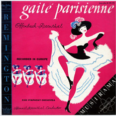
At
left Victor LM 1817 from 1954 with an inspiring, sexy photograph covering Gaité
Parisienne performed by the Boston Pops Orchestra conducted by Arthur Fiedler.
This recording was one of the first RCA stereo recordings but could only be released
as a Living Stereo issue in 1958 when the stereo format was launched. Later another
recording was done with Fiedler and released on LSC 2267 with a new cover.
From
then on also older recordings were reissued in covers adorned with photographs.
This was however not the case with the release of Offenbach's Gaité
Parisienne conducted by Arthur Fiedler of which there was an earlier recording
from 1950 issued on LM 1001. The release on LM 1817 was a new recording and had
a sexy picture of a voluptuous leg of a cancan dancer.
Early
designs, in particular the one with the Robert Shaw Chorale on RCA from 1954,
may have inspired many a photographer and designer, like famous Dutch photographer
Paul Huf when he started making the covers for the Philips S-L Series
with model Ann Pickford from England and typography by Harry van Borssum.
It was Paul Huf who took the application of photography to a new creative and
high artistic level. As Philips' Phonografische Industrie was issuing much
of the Columbia catalog in Europe, original US releases were sent to Baarn in
the Netherlands. And these also may have triggered producer Margreet Korsman to
hire Paul Huf to follow the new trend. She visited him to discus the assignment
in March 1954.
Proof
of the inspiration by the RCA covers could be Huf's cover for the Piano Concertos
of Franz Liszt performed by pianist Cor de Groot and the Residency Orchestra conducted
by Willem van Otterloo, reminiscing the lady in red on the early RCA cover. The
same applies to his cover for Ballet Music by Delibes and Gounod with conductor
Jean Fournet. Nevertheless Paul Huf's creations are very artistic and imaginative,
and all in a very original style. In a similar style is the photography for the
Philips S-L edition of Scheherazade played by the Philadelphia Orchestra conducted
by Eugene Ormandy.
The
first ten releases in the Philips Favourites Series were presented to the press
and the public in September 1956. Existing recordings were issued as in the case
of the Liszt Concertos performed by Cor de Groot and Willem van Otterloo which
were recorded in the Concertgebouw in Amsterdam on 24 March, 1951. Many new recordings
were made in 1955, 1956 and 1957 to be included in the Favourite Series.
Columbia
naturally had covers designed in a similar style which was more or less pioneered
by RCA as shows the late release on LP of Oscar Levant's Gershwin recordings originally
made in the 78 RPM era. The photographer was Hal Reif.
An
example of the new trend to use photography in combination with graphics, and
the use of plain photography is the release by Philips of the Columbia recording
CL 548 which was first issued in the spring of 1954.
Two
different covers for Buck Clayton's most famous Jam Session on Philips
B 07022 L: Buck Clayton and Joe Newman (trumpets), Urbie Green and
Henderson Chambers (trombones), Lem Davis (alto sax), Julian Dash
(tenor sax), Charlie Fowlkes (baritone sax), Sir Charles Thompson
(piano), Freddie Green (piano), Walter Page (bass), and Jo Jones
(Drums). The titles: The Huckle-Buck, and Robins' Nest (also written
Robin's Nest).
The
early hybrid design (graphics and pictures) of Philips B 07022 L, was eventually
replaced by a powerful picture of Buck Clayton playing the trumpet. The second
edition was pressed from new plates and released around 1957. Although Alex Steinweiss
already combined graphics and bits of photographic images in the nineteen forties
on the 78 RPM albums.
In
the late 1950s many an old Remington recording had a new disguise with a photograph
on the cover and were now available on one or several of Gabor's other labels
like Masterseal, Paris, Webster, and Palace. In 1958 the Remington label
was discontinued. Below is the cover of Palace M-601 with Tchaikovsky (Romeo
and Juliet Overture) and Grieg (Peer Gynt Suite No. 1), performed by the Viennese
Symphonic Orchestra under fake conductor Kurt Baumann, a substitute for Kurt Wöss
(Tchaikovsky) as well as H. Arthur Brown (Grieg).
When
Don Gabor had revived his Continental label in the nineteen sixties he once in
a while issued a beautiful gatefold edition like this disk with Gypsy Music played
by Markoff and his Romany Strings on CST-2005.
After
the craze of using photography had more or less passed, new generations of artists
were designing labels and covers and corporate house-styles. Now al styles and
techniques were used side by side, many times inspired by the pioneers of the
early days. Many record collectors and artists regret that the small size
of the jewel case of the CD gives less opportunity to make an artistic cover.
But within the restrictions there are quite a few remarkable CD covers and booklets.
Yet, the CD with art work and the small lettering is sometimes qualified as neat
or cute, while an LP cover can be utterly impressive.
Remarkable
is that the great Alex Steinweiss was the creator of the basic design for a budget
label like Don Gabor's Remington LP records. He did this from 1952 on, till about 1958 when the Remington label ceased
to exist. By doing this he added to the importance of the label and made Remington
records easily recognizable. His basic concept had to be filled in by other artists
and designers as well. He gave them enough freedom to express their own artistry.
Rudolf
A. Bruil - Page first published, September 2001 - and updated since.
All covers from my private record collection.
Page
first published on September 12, 2001 on members.chello.nl and expanded since.
-----
THE REMINGTON COVERS -----
At left
the Steinweiss cover for Goyescas (Granados) played by pianist Frieda Valenzi.
At right one of the two Steinweiss covers for the complete set of Paganini Caprices
played by violinist Ossy Renardy with Eugene Helmer at the piano..
In
most cases Steinweiss's designs for Remington are not as elaborate as those he
made for Columbia. Yet the covers for Dvorak's Slavonic Dances and Contemporary
Piano Compositions (Kodaly, Kabalevsky, Bartok) are very effective. The exquisite
beauty of the cover for the release of Schubert's Tragic (4th) Symphony conducted
by Kurt Wöss is striking.
Above
two more Steinweiss covers: Dvorak's Slavonic Dances with Georges Singer conducting
and Variations Symphoniques (Franck) with pianist Frieda Valenzi. At right Scarlatti
Sonatas played by harpsichordist Sylvia Marlow.
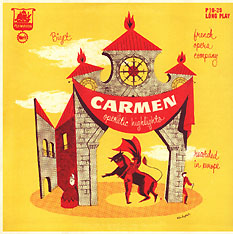
At left the cover by Steinweiss for Rimsky-Korsakov's Scheherazade. The same cover
was used for the H. Arthur Brown recording as well as the performance with conductor
Karl Rucht. Both with the same reference number R-199-11. At right the restyled
cover for the vocal highlights of the opera Carmen (Bizet) with the Paris Opera
conducted by Jean Alain, R-199-15.
Carlos
Montoya plays the guitar and Lydia Ibarrondo sings on R-199-134 . This cover is
also by Steinweiss as is the cover for pianist Alexander Jenner's recording of
Etudes (Studies) Op. 25 of Frederic Chopin, first released in December 1951 at
the same time as Kilenyi's Etudes Op. 10 recording on R-199-57. The cover is from
the fall of 1952.
A
rather simple cover for Beethoven's Pastoral Symphony on the old style Remington
label (RLP-199-7) by Curt John Witt. Sibelius 5th Symphony (R-199-201), Beethoven's
Violin Sonatas Nos. 2 and 8 (R-199-95), and the Sibelius / Glazunov (R-199-191)
are more elaborate. Kilenyi's Brahms (R-199-164), Bach played by Jörg Demus
(R-199-92), Stravinsky / Prokofiev with Eugen Szenkar, and Mozart's Requiem with
Joseph Messner are also by Witt.
At left
a rare cover designed by Rise, an unknown artist, for Kilenyi's Schumann/Chopin
recording. At right the cover for Conrad Hansen's Tchaikovsky Op. 23 with
the RIAS Symphony.
Curt
John Witt's cover for Gershwin's Concerto in F illustrates the modernity of the
work, the energy, and where it was composed. Next to it the recording of
compositions by Leon Stein and Robert Ward with a daring combination of red and
orange shades of colors.
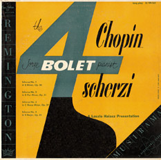
At right
the cover for the recording of Chopin's Scherzi played by Jorge Bolet. The cover
is by Curt John Witt - Remington R-199-161. At left the cover for Strauss Waltzes
performed bu Kurt Wöss and Felix Guenther.
Leonard
Slonevsky was a member of the Design House. He did the cover for Alec Templeton's
Offenbach and Strauss Improvisarions.
At
right the cover of the performances of Leonid Hambro of Piano Sonates (Mozart
K 331, Haydn Nos. 1 and 7). It is not indicated who the designer is.
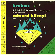
The
cover designed by Albitz for the excellent recording of Franz Liszt's Concerto
No. 1 and Totentanz played by Edward Kilenyi on Remington R-199-166. The design
was possibly inspired by the
biopic 'A Song To Remember' made of Liszt's contemporary Frederic Chopin (1945),
and
specifically the scene when supposedly Franz Liszt is playing in a dark salon
and George Sand (Merle Oberon) enters with a candelabra and lightens up the room
and the minds of the invited listeners. To the surprise of the attendants It is
not Franz Liszt who is playing, but Frederic Chopin.
Three
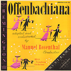
other covers by Albitz are for Manuel Rosenthal's Gaité Parisienne with
the RIAS Symphony - Remington R-199-172, for Rosenthal's Offenbachiana (R-199-183)
and for Gerhard Becker's recording of Selections from The Merry Widdow (Franz
Lehar) and One Night in Venice (Johann Strauss) on Remington R-199-170.
H.
Kaebitz created a strong cover for Symphony Fantastique (R-199-176). The covers
for the two Wagner programs played by the RIAS Symphony Orchestra conducted by
George Sebastian are also from his hand: R-199-174 and R-199-177 respectively.
The
cover for the Young Violinist's Editions is also by Kaebitz.
It
is not sure if either Kaebitz or Albitz made the design for the Diamant releases
of Remington recordings issued by Gabor in Germany.
Rudolph
de Harak designed a sober cover for Zoltan Fekete's Bruckner Symphony No. 3 on
R-199-138.
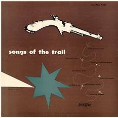
Also
by Rudolph de Harak is the cover for Remington R-199-8 with Beethoven's 7th Symphony
conducted by Kurt Wòss and for the LP "Songs of the Trail", a
Pontiac release (P-533).
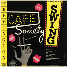
At right
Einhorn's cover for the 10" Remington R-1032: Cafe Society Swing.
At
left the cover for the Hungarian Rhapsodies (Liszt) and Hungarian Dances (Brahms)
conducted by Karl Rucht. Cover of R-199-218 by Curt Goldblatt.
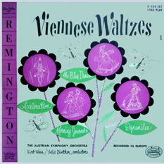
Einhorn's
cover for the 10" Remington (R-1028) with The Blue Danube, Estudianta, Acceleration
Waltz, and a selection from The Fledermaus, all played by the Vienna Radio Orchestra.
In
general the covers for the Remington records were more elaborate than those for
the Merit and Plymouth-Merit labels. Exceptions are several covers made by Einhorn.
For instance for the Plymouth-Merit P-10-20 release of selections of Bizet's Carmen
performed by "French opera company", the equivalent of R-199-15. And
there is the Plymouth-Merit release of Beethoven's Piano Concerto No. 1 in C Op.
15 played and conducted by Fritz Egger on PL12-25.
The
Plymouth-Merit release of Cesar Franck's Symphony in D (P-12-4) is the same as
Remington R-199-36, the performance conducted by Hans Wolf but the Plymouth does
not mention the name of the conductor.
At
right the Merit cover made by Wattley for H. Arthur Brown's Schubert Unfinished
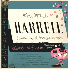
Symphony. At far right the Steinweiss cover for baritone Mack Harrell's recital
on R-199-140.
Gold,
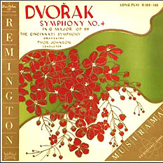
green and red are the elements Otto Rado used to depict his idea of Dvorak's 4th
(8th) Symphony performed by the Cincinnati Symphony under Thor Johnson (R-199-168)
Otto
Rado's use of vivid colors in a dynamic drawing for the boxed set of the Aida
recording are inspirational. His cover art was most certainly an incentive for
buying the 3 LP box of Verdi's masterpiece. Click on the
cover to enlarge the front of the boxed set R-199-178/3. He may also have been
responsible for the artwork on the Kreisler recording of Michèle Auclair
and Gaspar Cassado.
The
performance of Tchaikovsky's Violin Concerto by Michèle Auclair and Kurt
Wöss was issued on Plymouth P-12-121. But then the violinist is named Renée
Marcel and the orchestra the Europe Symphony Orchestra. It was released in another
flamboyant design by Rado.
The
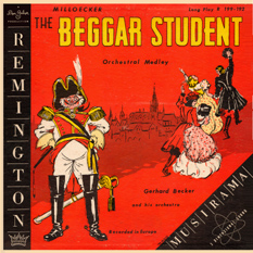
recording of Gaité Parisienne with cover by Albitz was duplicated on Plymouth
with a cover by Otto Rado. The selections from The Beggar Student was also from
Rado's hand.
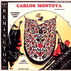
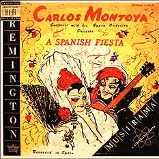
Rado's
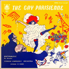
designs for the Carlos Montoya recordings depict the exuberant and extravert nature
of the flamenco. (R-199-171 and R-199-179). Yellow and red seem to be his favorite
colors as is evident also in the Gay Parisienne Plymouth LP. Yet it is not sure
if he did the artwork for the cover of Prokofiev's Second Piano Concerto with
pianist Jorge Bolet and conductor Thor Johnson (R-199-182). At lower right
his cover for the Plymouth title Jazz, Bebop, Blues (PL-12-113).


 with the Paris Opera conducted by Jean Alain, R-199-15")


 From
that day on, of every new release sales were boosted above average and the artistic
packaging became an important part of the record. Soon this idea was adopted by
every record company.
From
that day on, of every new release sales were boosted above average and the artistic
packaging became an important part of the record. Soon this idea was adopted by
every record company. 


 Gabor
and Halasz were moving in artistic circles meeting other producers (for example
those of the Bertelsmann firm); radio people (when they were negotiating the recording
of the Glazunov Violin Concerto performed by Roman Totenberg); musicians like
cellist Eberhard Finke, leader of the 12 Cellist of the Berlin Philharmonic, violinist
Saschko Gawriloff and members of the Koeckert Quartet. In this way they got acquainted
with the artistic and intellectual life in Berlin of 1954. It is very plausible
that they also met with Ruth Geiss who was married to Hans Albitz.
Hans and Ruth Albitz were a young designer couple. They were in their early thirties
at the time and had already made a name for themselves in Germany.
Gabor
and Halasz were moving in artistic circles meeting other producers (for example
those of the Bertelsmann firm); radio people (when they were negotiating the recording
of the Glazunov Violin Concerto performed by Roman Totenberg); musicians like
cellist Eberhard Finke, leader of the 12 Cellist of the Berlin Philharmonic, violinist
Saschko Gawriloff and members of the Koeckert Quartet. In this way they got acquainted
with the artistic and intellectual life in Berlin of 1954. It is very plausible
that they also met with Ruth Geiss who was married to Hans Albitz.
Hans and Ruth Albitz were a young designer couple. They were in their early thirties
at the time and had already made a name for themselves in Germany. The
covers for the respective recordings of the RIAS Symphony Orchestra with conductor
Manuel Rosenthal, pianist Edward Kilenyi and conductor Jonel Perlea, and the recording
made with Gerhard Becker, all bear the name Albitz. Although there are people
in America with the name Albitz, these covers must have been designed by the Albitz
couple, and specifically the Gerhard Becker recording by Ruth Albitz. The style
of that cover reminds one of the cover for the book 'Sei Schön und Charmant'
(Be Beautiful and Charming) by author Alma Archer, with drawings by Ruth Albitz-Geiss.
The influence of her husband is seen in the more formal designs of LP covers.
The
covers for the respective recordings of the RIAS Symphony Orchestra with conductor
Manuel Rosenthal, pianist Edward Kilenyi and conductor Jonel Perlea, and the recording
made with Gerhard Becker, all bear the name Albitz. Although there are people
in America with the name Albitz, these covers must have been designed by the Albitz
couple, and specifically the Gerhard Becker recording by Ruth Albitz. The style
of that cover reminds one of the cover for the book 'Sei Schön und Charmant'
(Be Beautiful and Charming) by author Alma Archer, with drawings by Ruth Albitz-Geiss.
The influence of her husband is seen in the more formal designs of LP covers.

 The
designs of the Remington covers are at times a bit simple and reflect a somewhat
childish optimism, one could say. To a large extend this style was imposed by
the technique of plate production and the printing process available in those
days, a technique which had its restrictions. The intensity and shade of colors
varied as in those days the Pantone Matching System (PMS) - which was devised
by Lawrence Herbert in 1963 and has been the reference for designers, art directors,
and printers ever since - did not yet exist. The mixing of the paint was not always
done in the same manner. So if you encounter a pale cover, there is no deliberate
argument behind it. It is just a print from ink/paint of a slightly different
mix.
The
designs of the Remington covers are at times a bit simple and reflect a somewhat
childish optimism, one could say. To a large extend this style was imposed by
the technique of plate production and the printing process available in those
days, a technique which had its restrictions. The intensity and shade of colors
varied as in those days the Pantone Matching System (PMS) - which was devised
by Lawrence Herbert in 1963 and has been the reference for designers, art directors,
and printers ever since - did not yet exist. The mixing of the paint was not always
done in the same manner. So if you encounter a pale cover, there is no deliberate
argument behind it. It is just a print from ink/paint of a slightly different
mix. 


")